
Splitwise
Redesigned
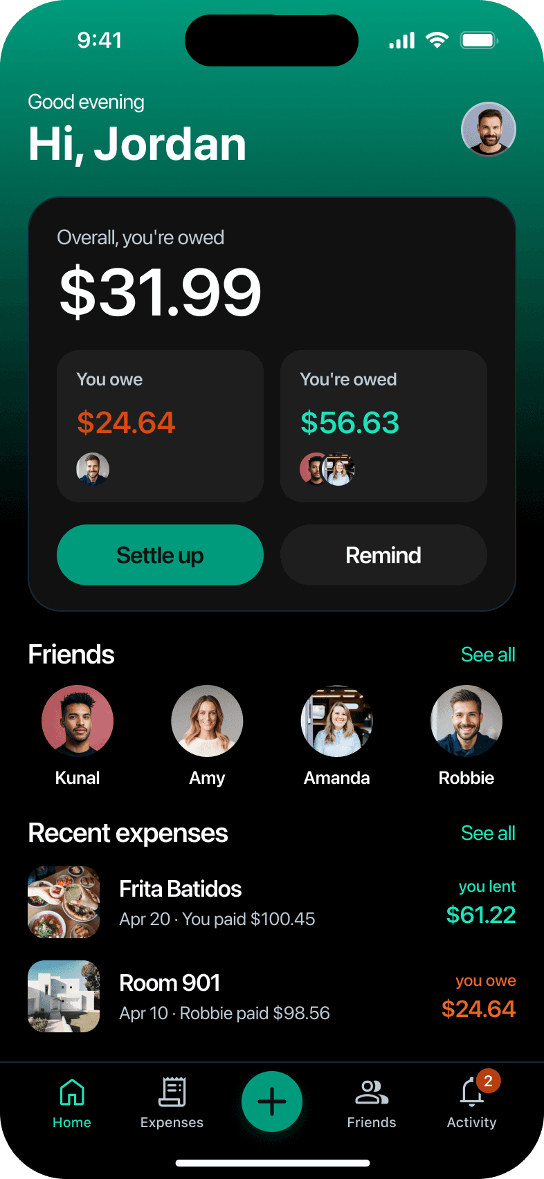
Splitwise helps friends keep track of shared expenses. I rebuilt its design system and designed Smart Split, which reads a photo of the receipt and lets each person claim what they ordered.


My role
Product Designer
Team
Solo
Timeline
One month
Status
Prototyped in Figma
Smart Split, step by step
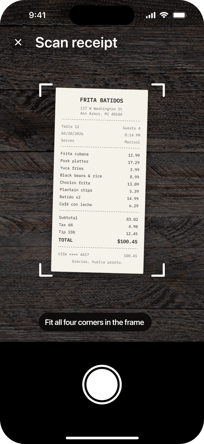
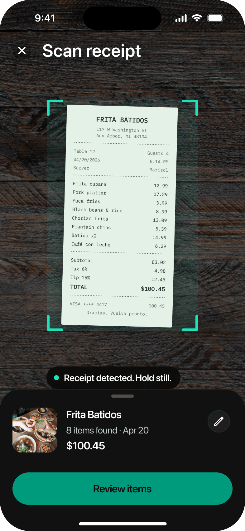
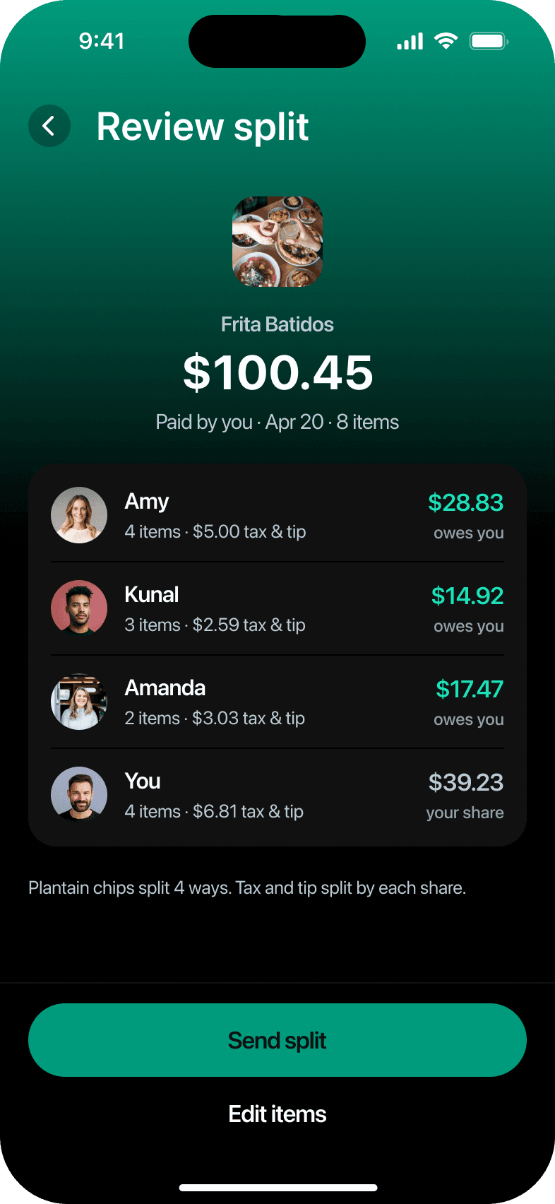
Four friends, one $100.45 dinner bill. Follow it from the receipt photo to the last payment.Scan the receiptTap + and photograph the receipt.Items, tax and tip are read for you.
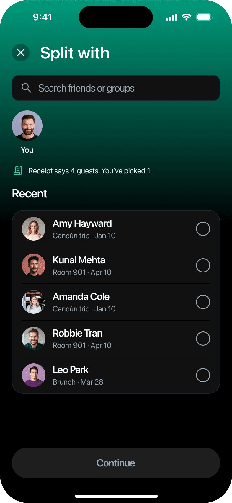
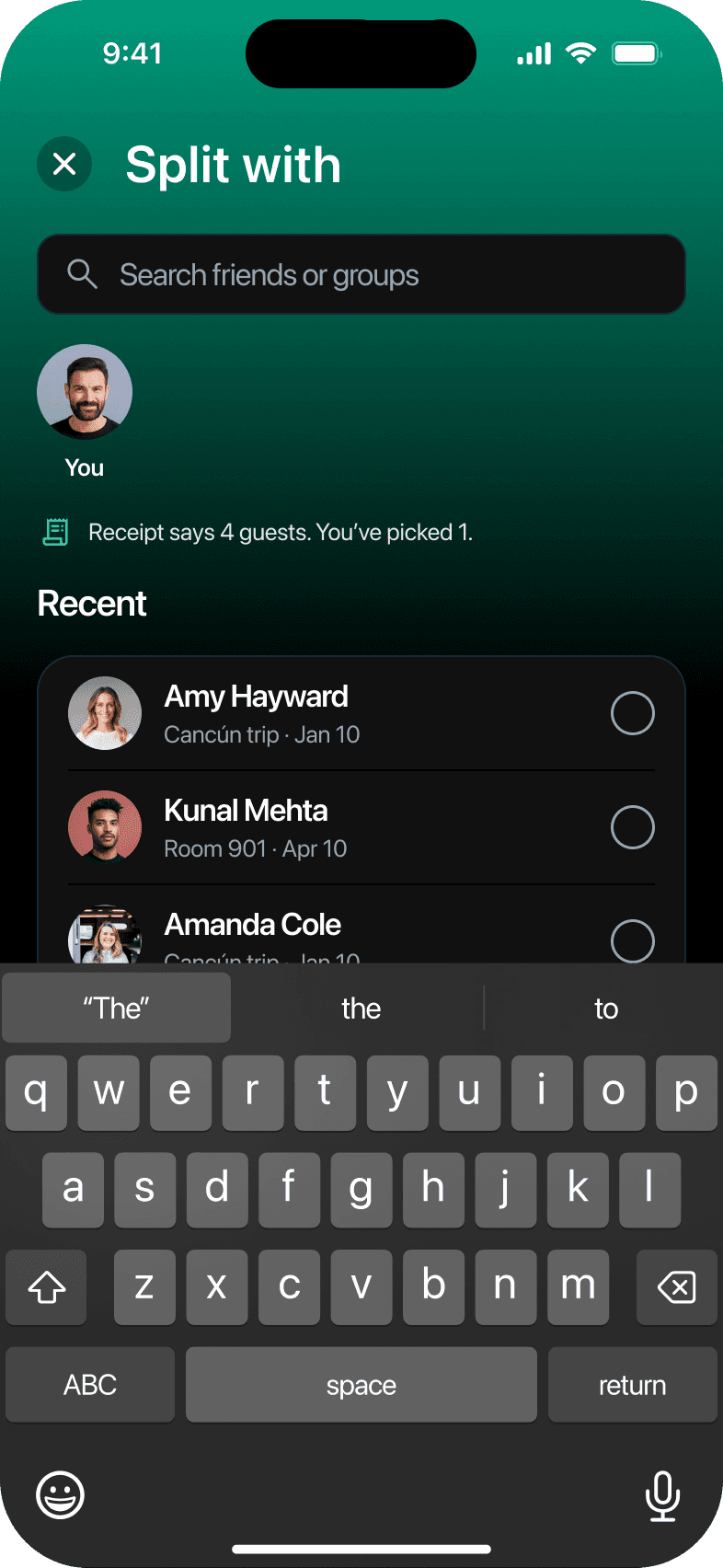
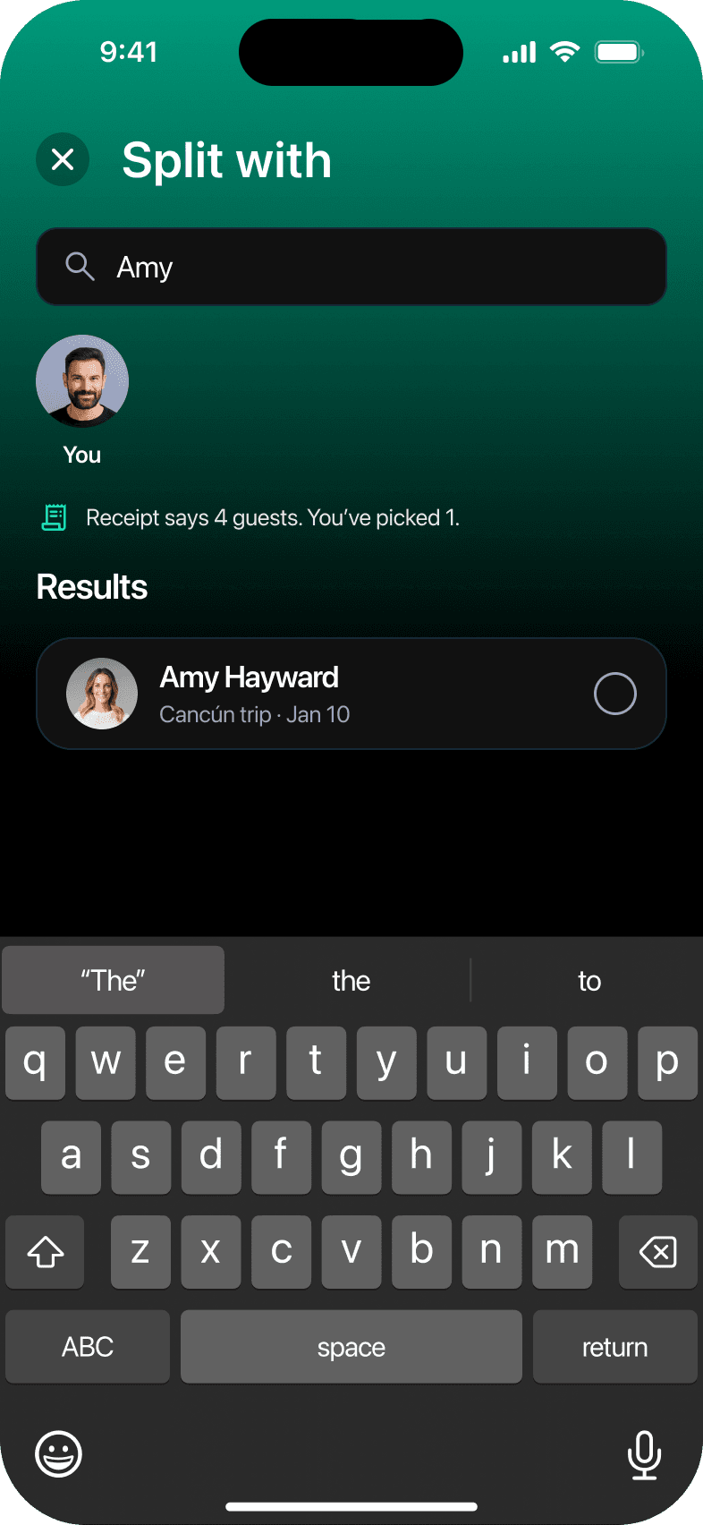
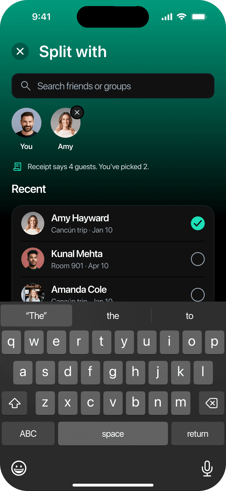
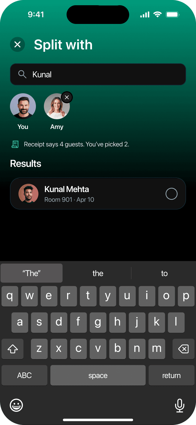
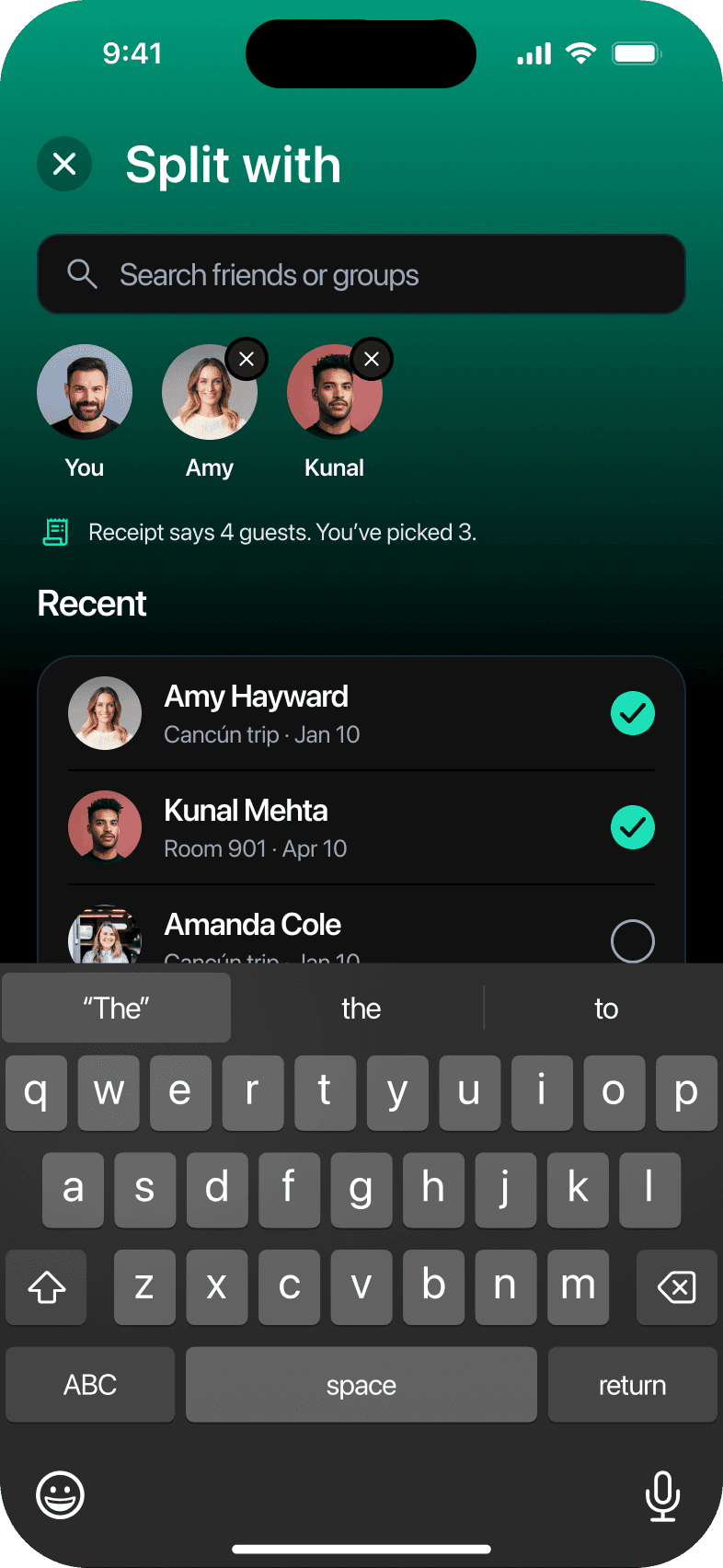
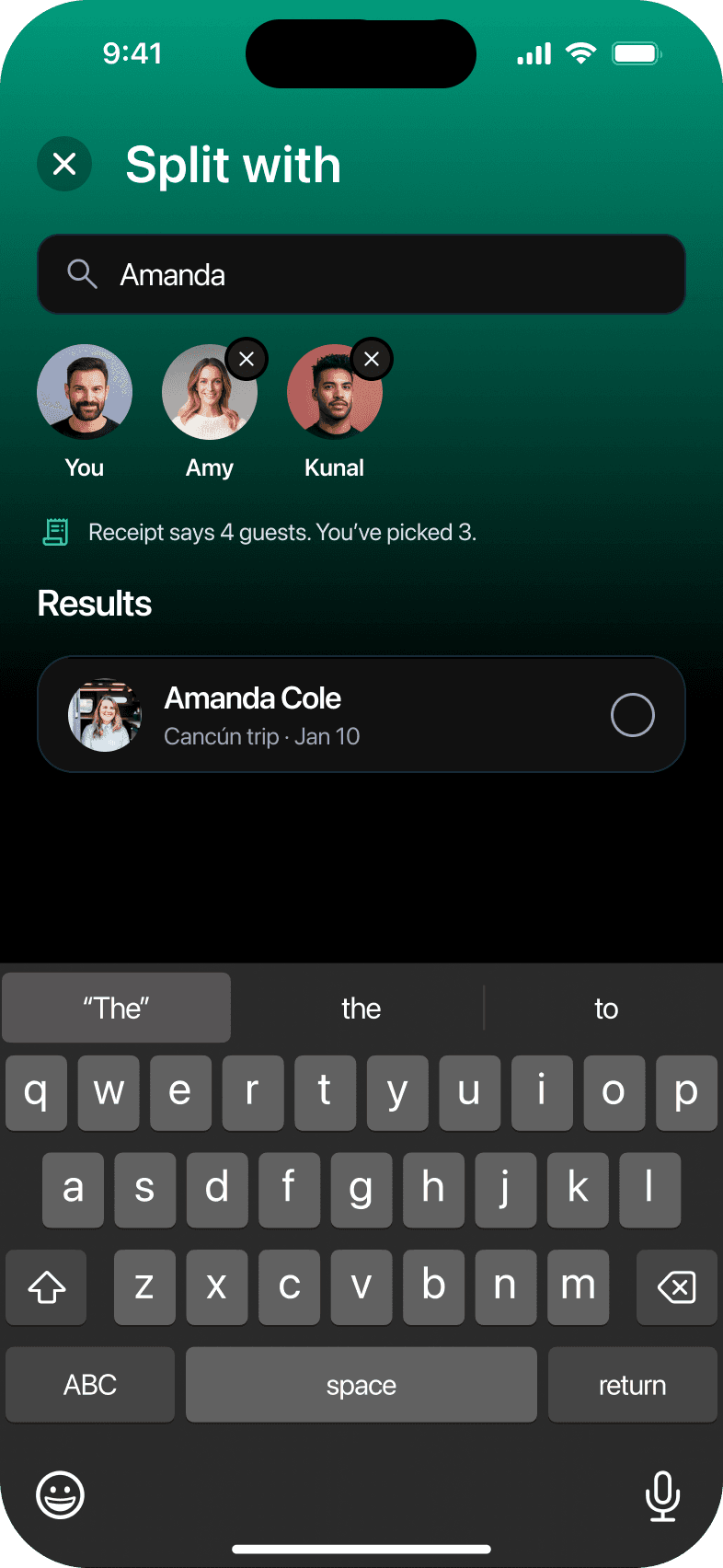
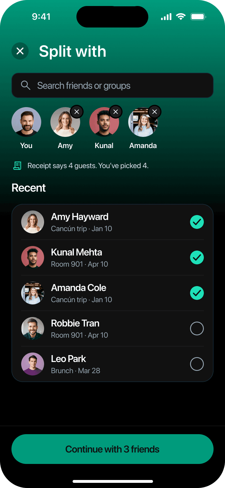
Add friendsSearch by name to add each person.The receipt's guest count shows who's missing.
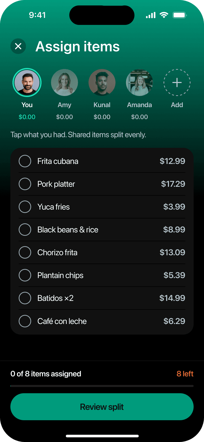
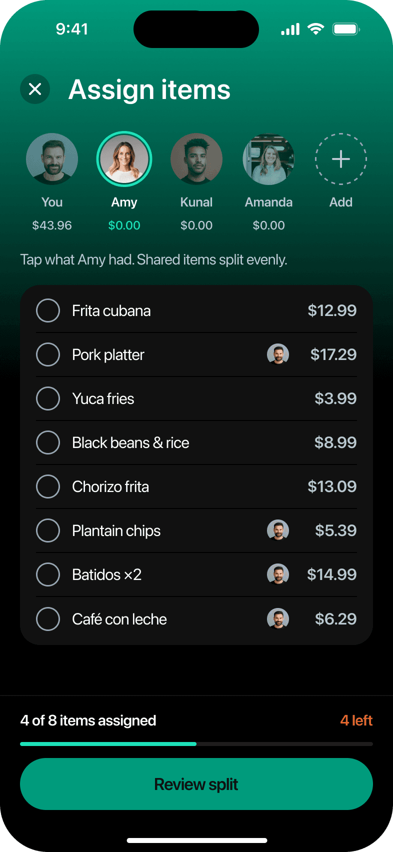
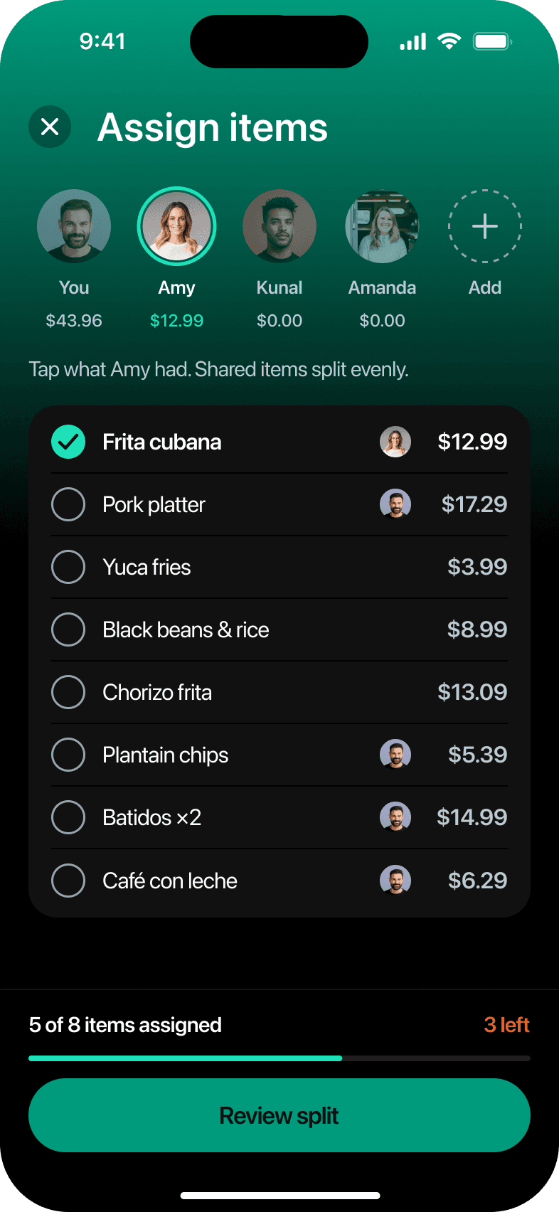
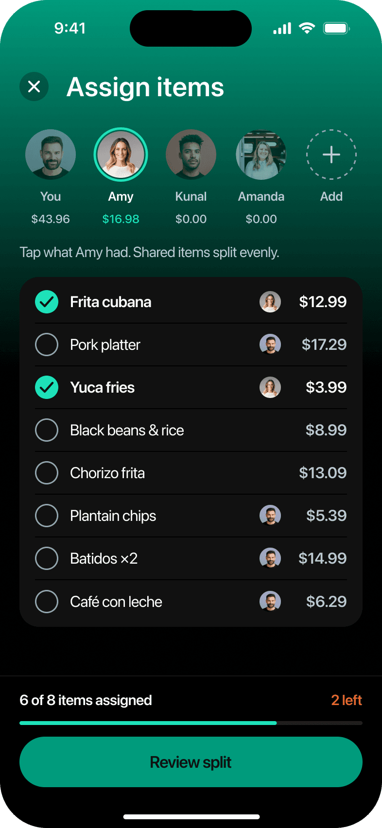
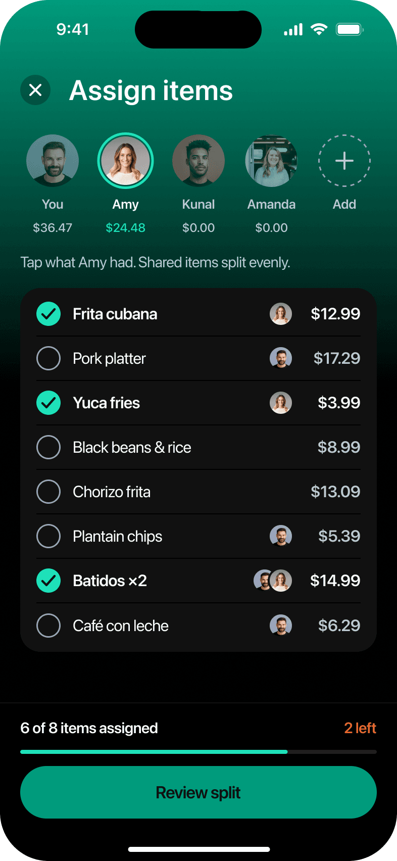
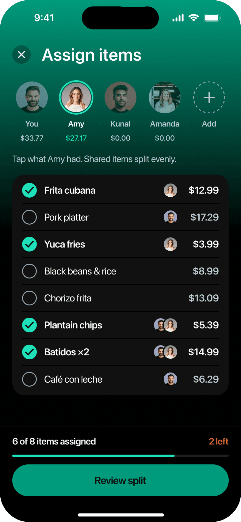
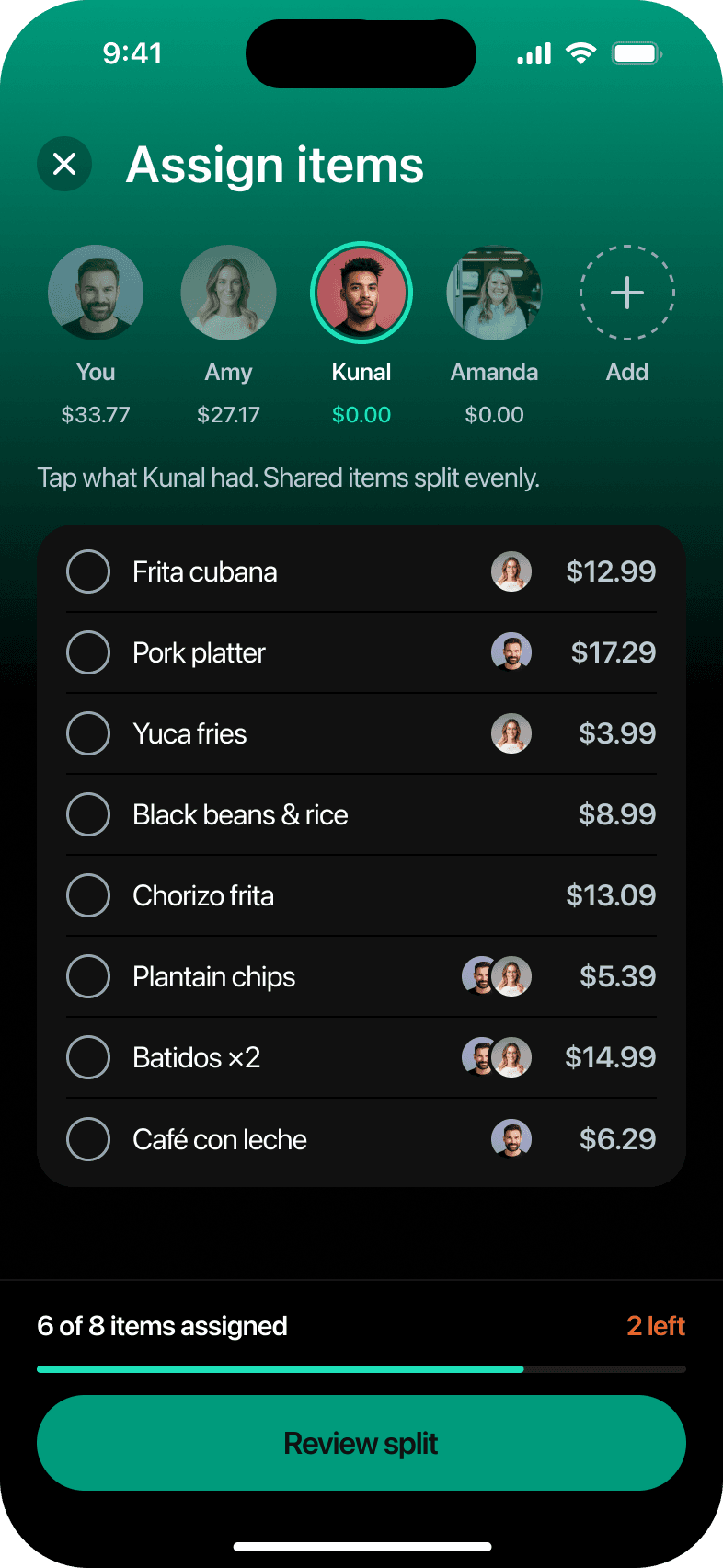
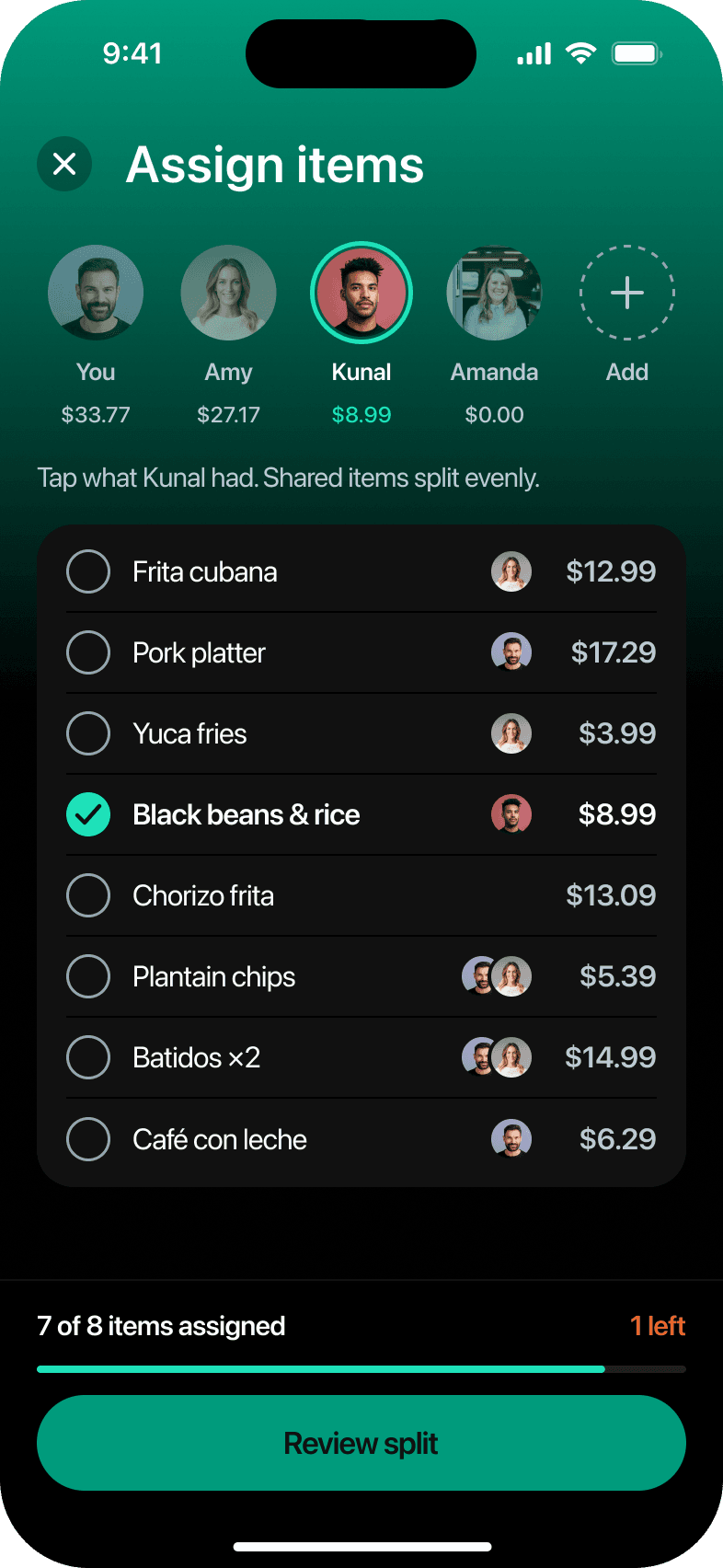
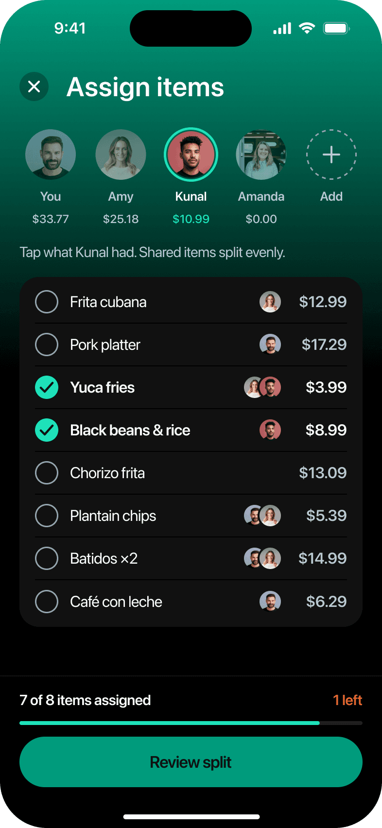
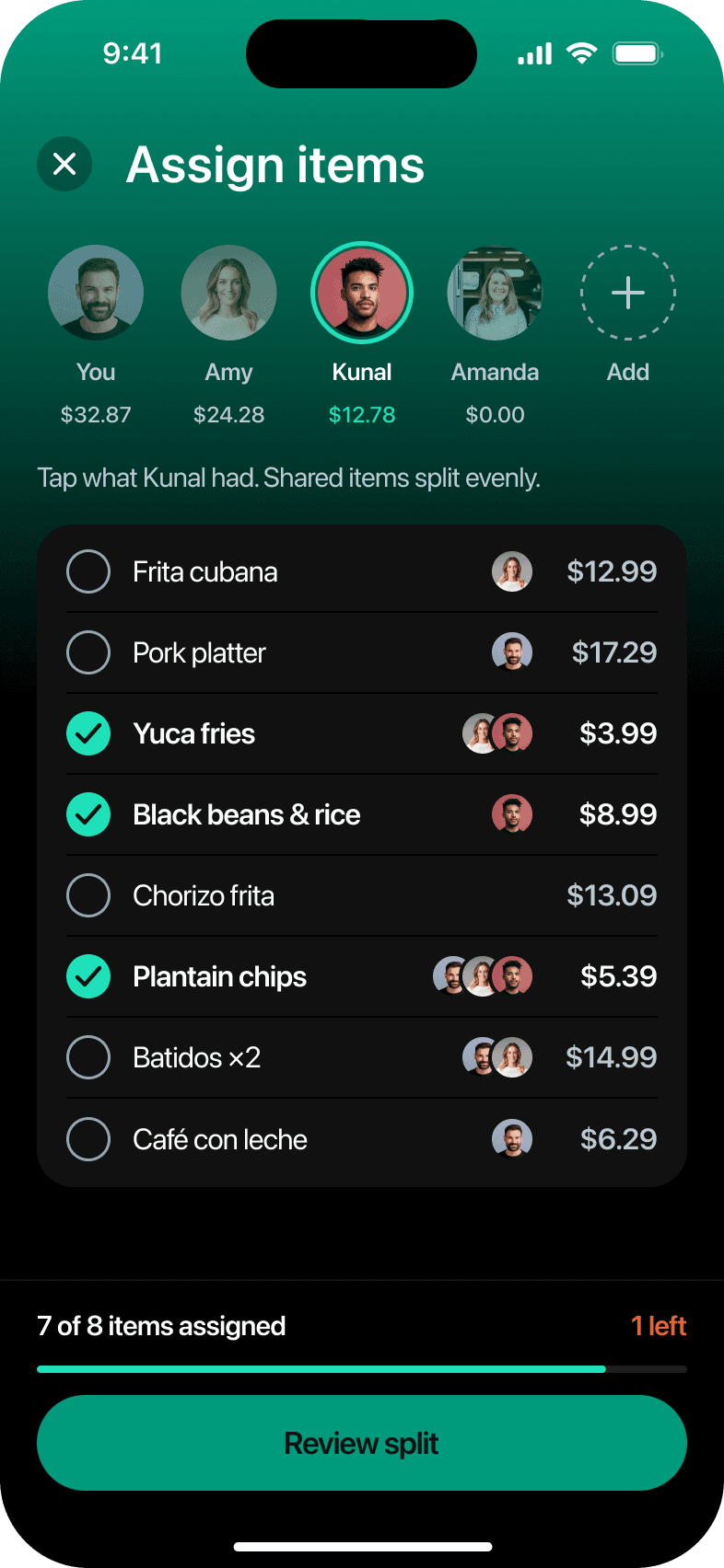
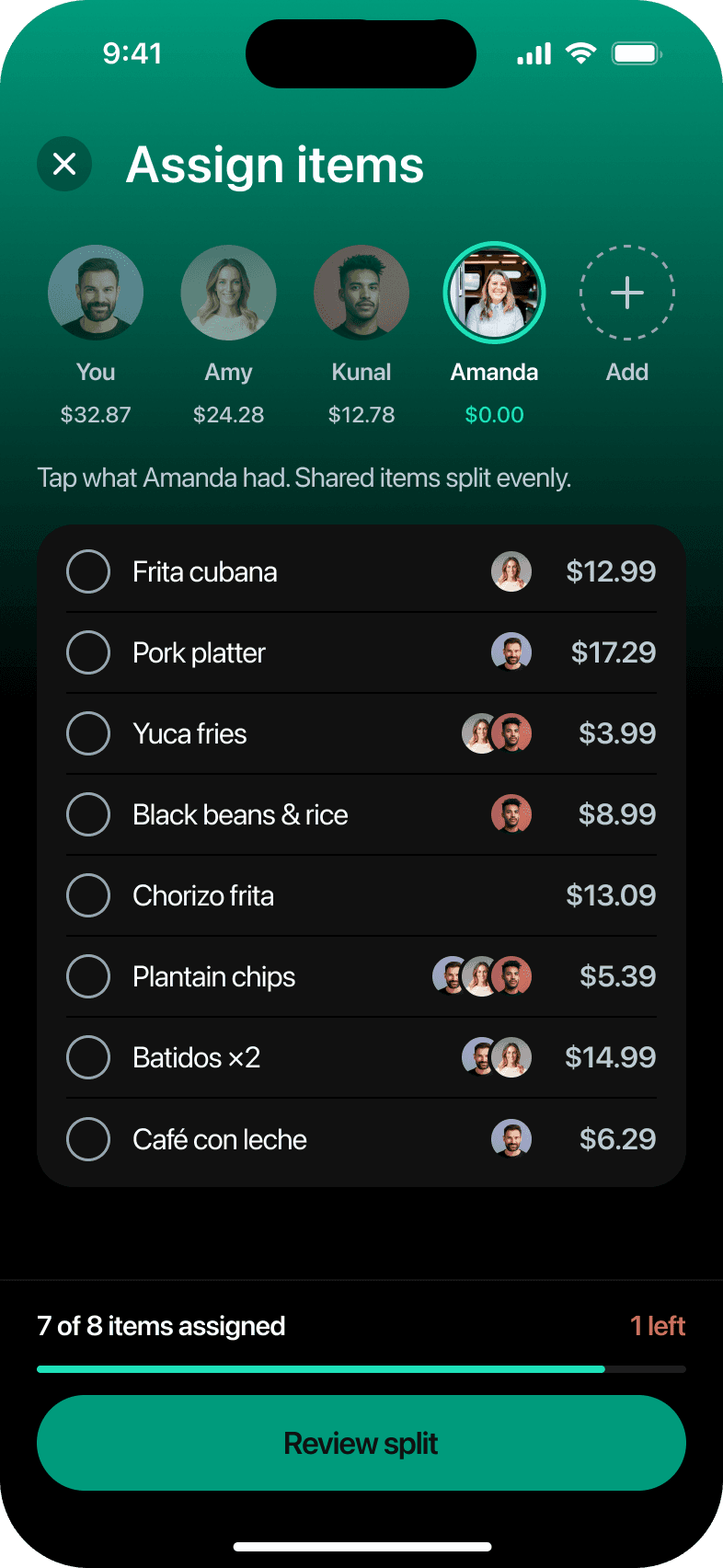
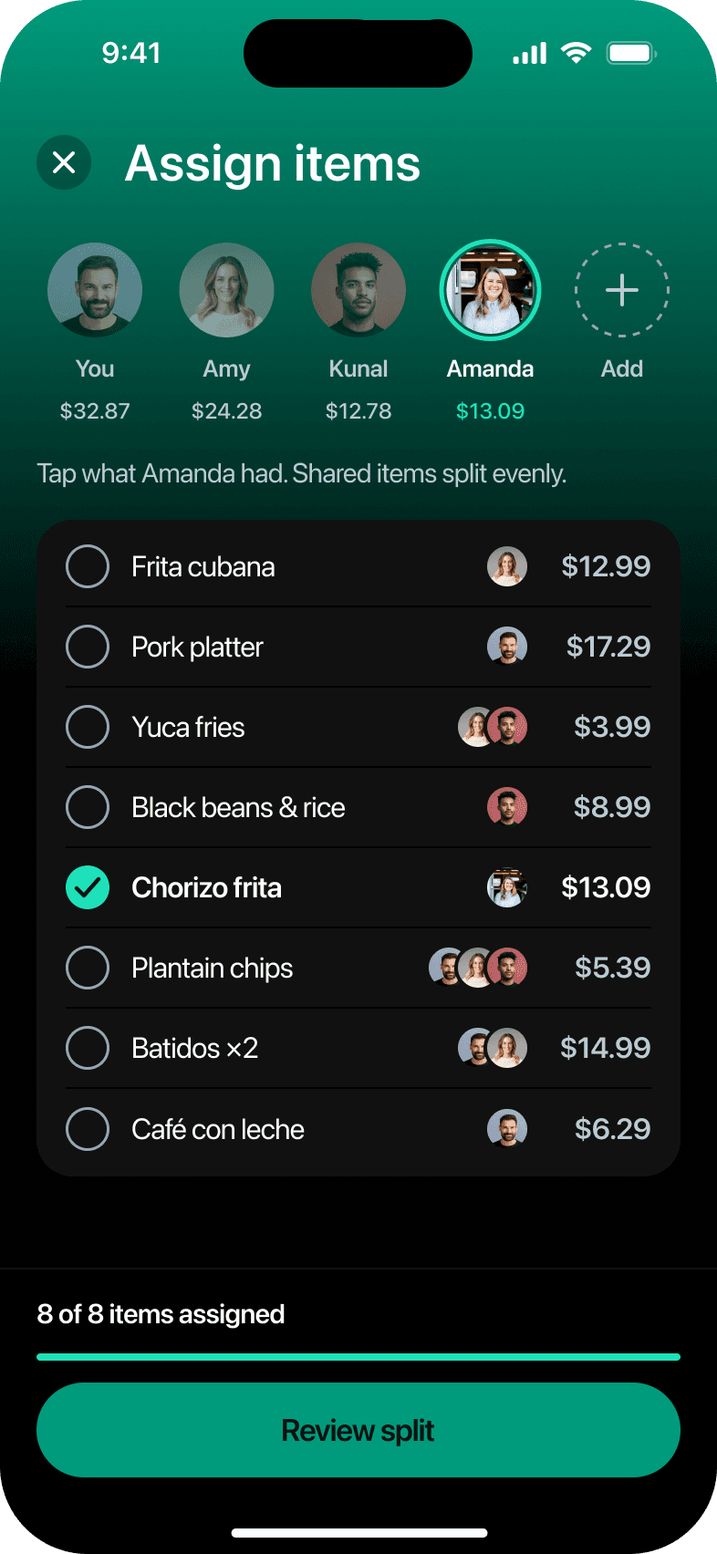
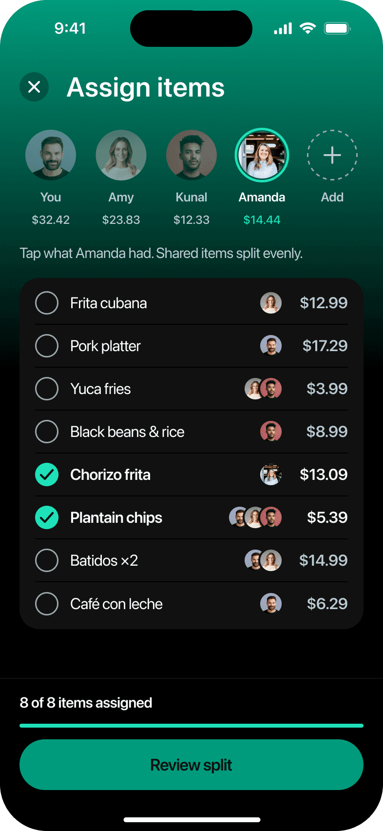
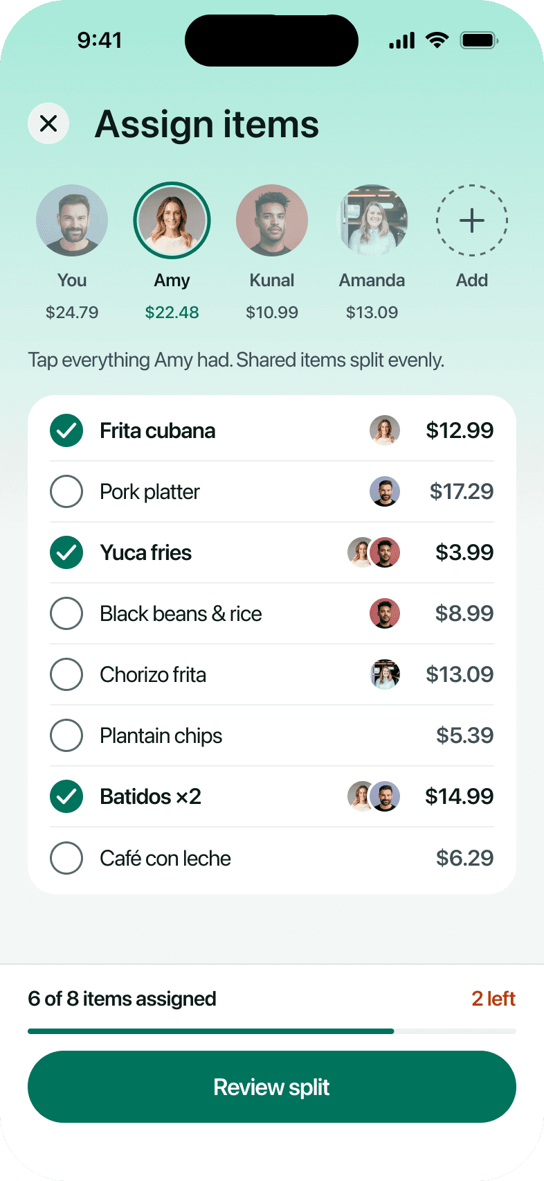
Assign itemsSelect a person, then tap what they ordered.Their total updates with every tap.
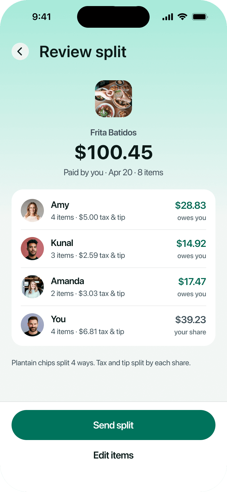
Review the splitEach share includes its part of the tax and tip,and together they match the $100.45 receipt.
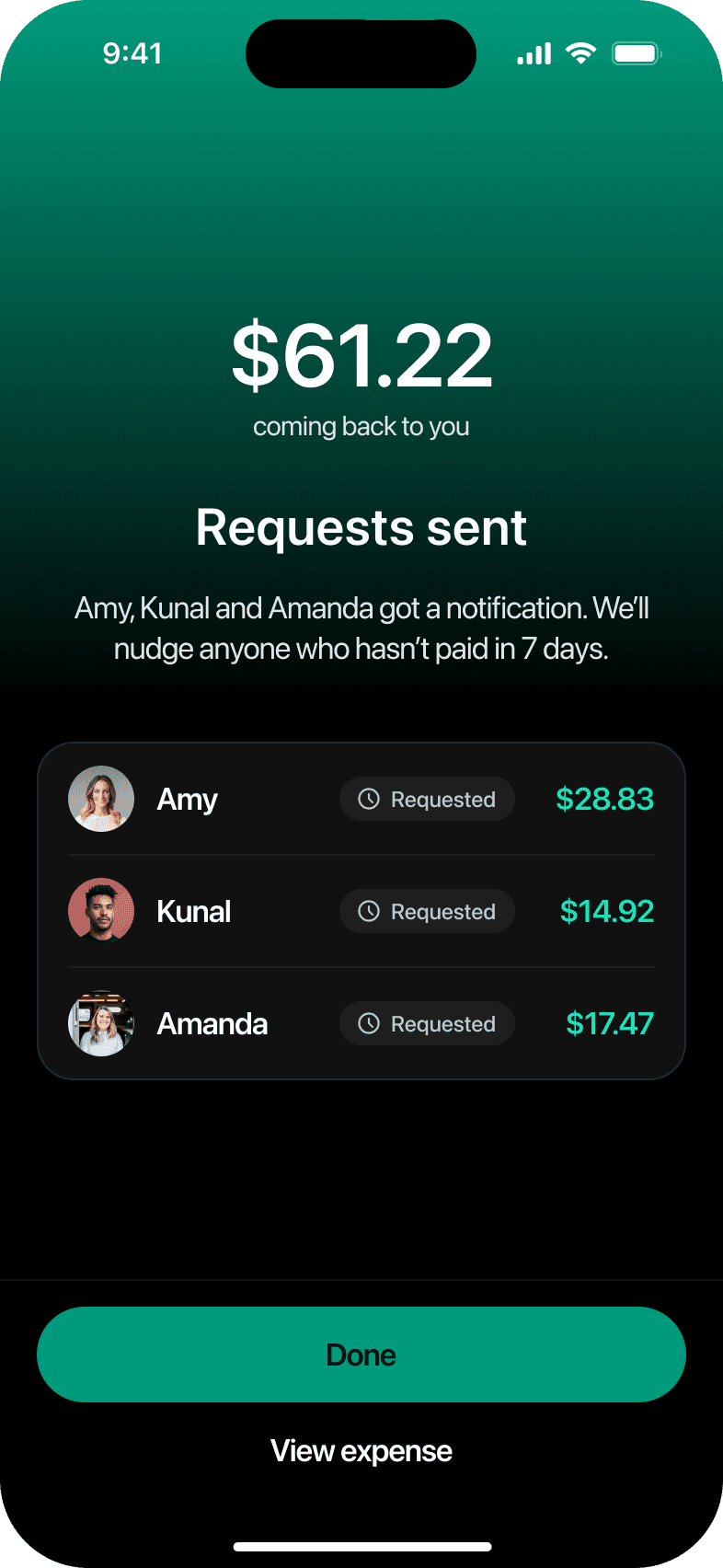
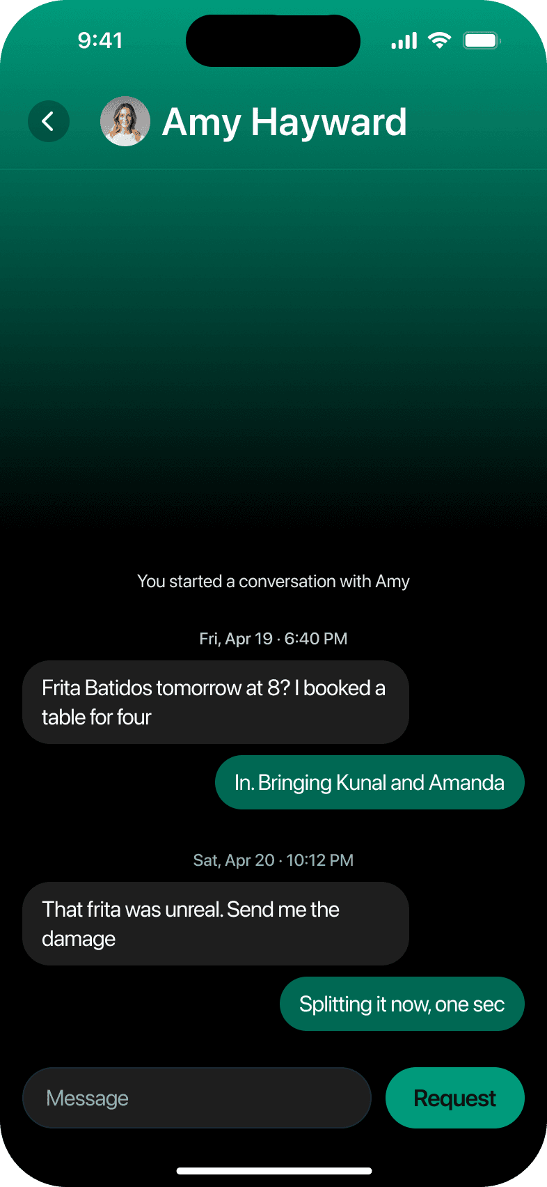
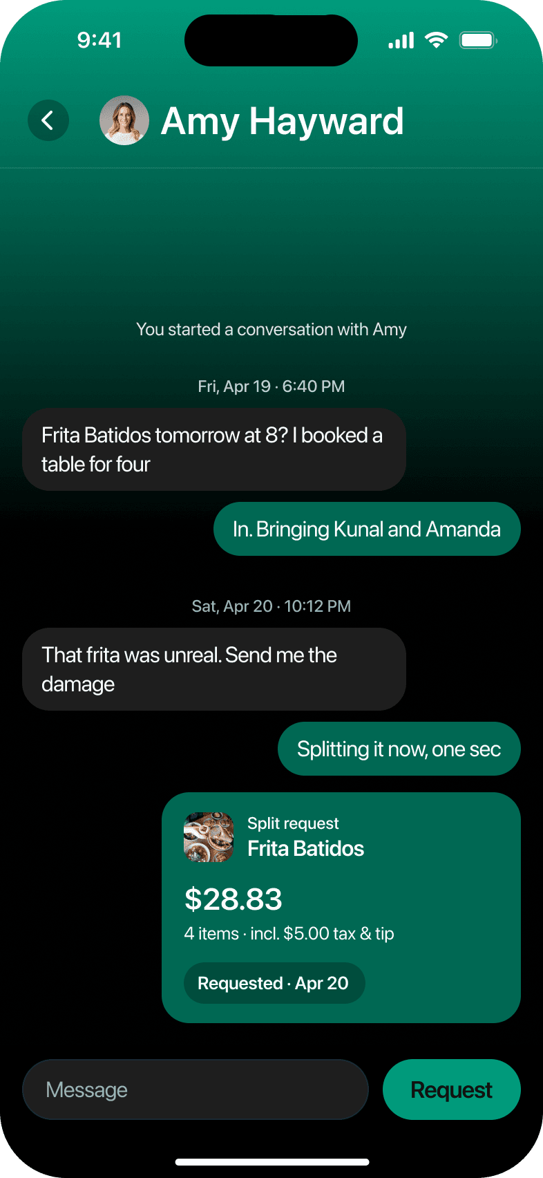
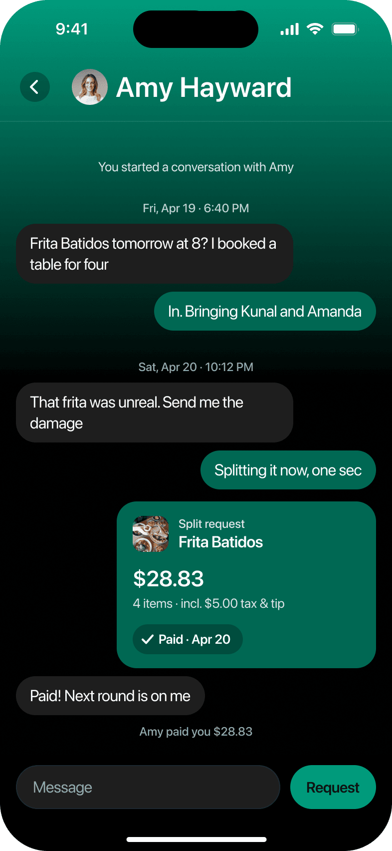
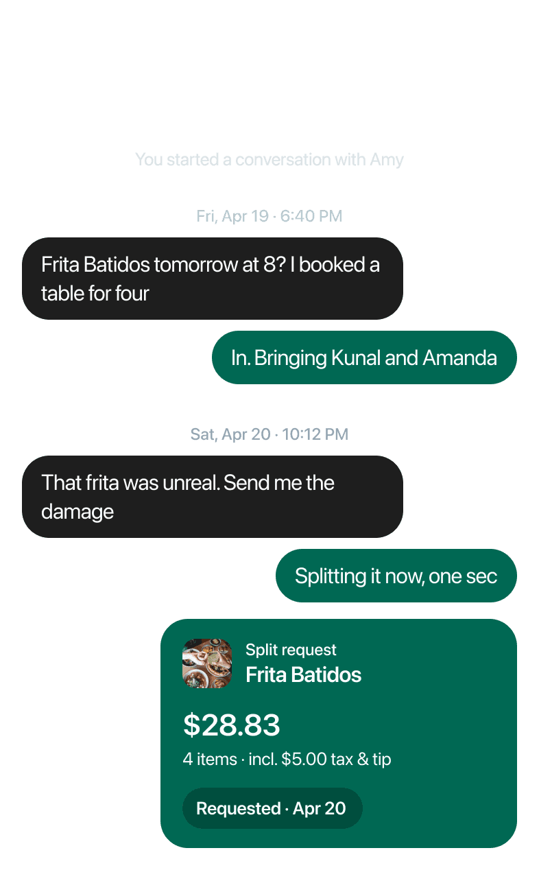
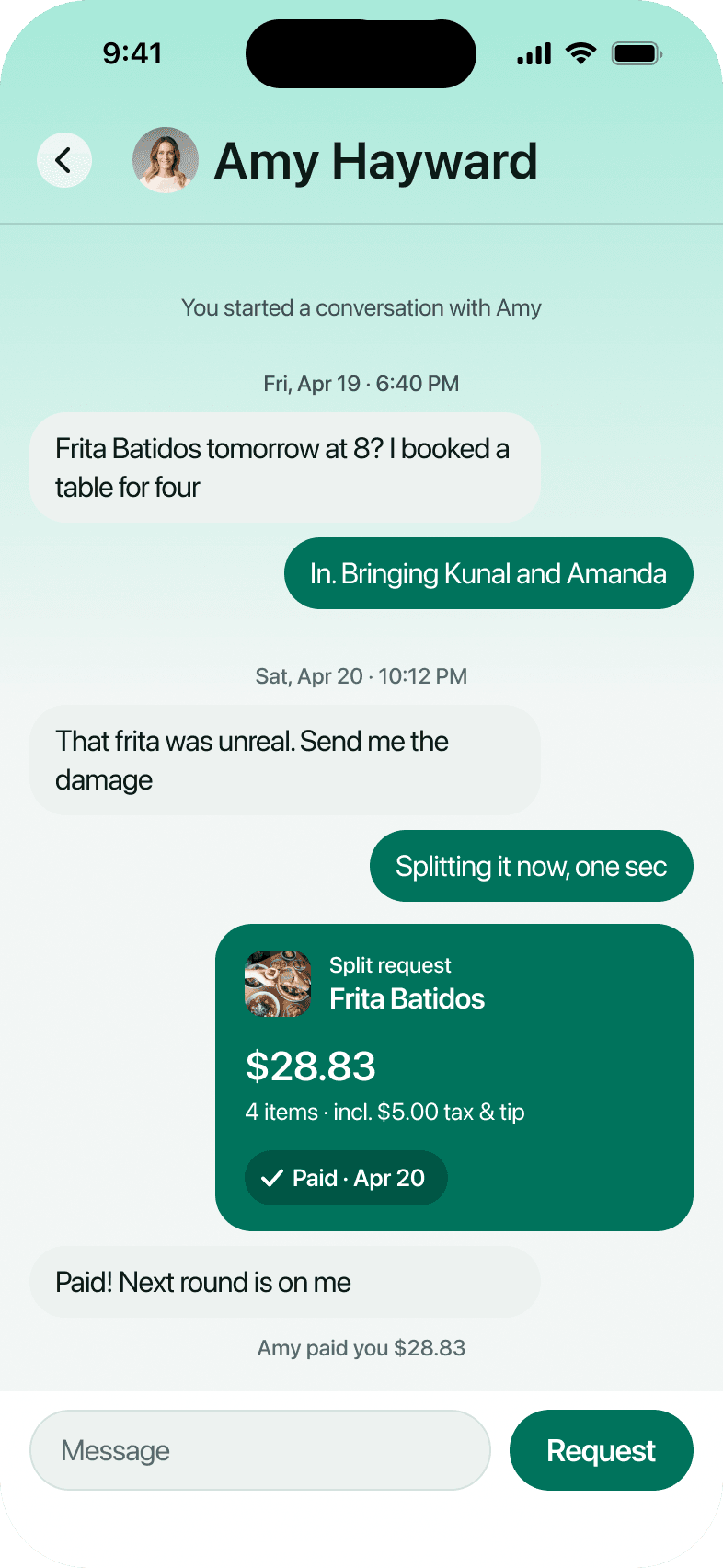
Send requestsOne tap sends each friend their share.It arrives in your chat and updates once paid.
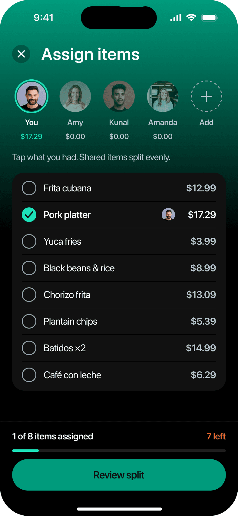
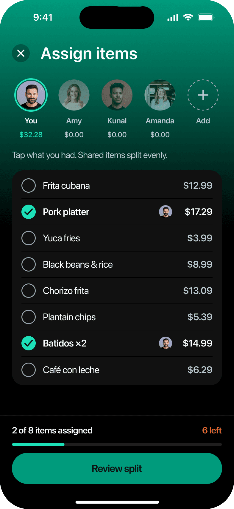
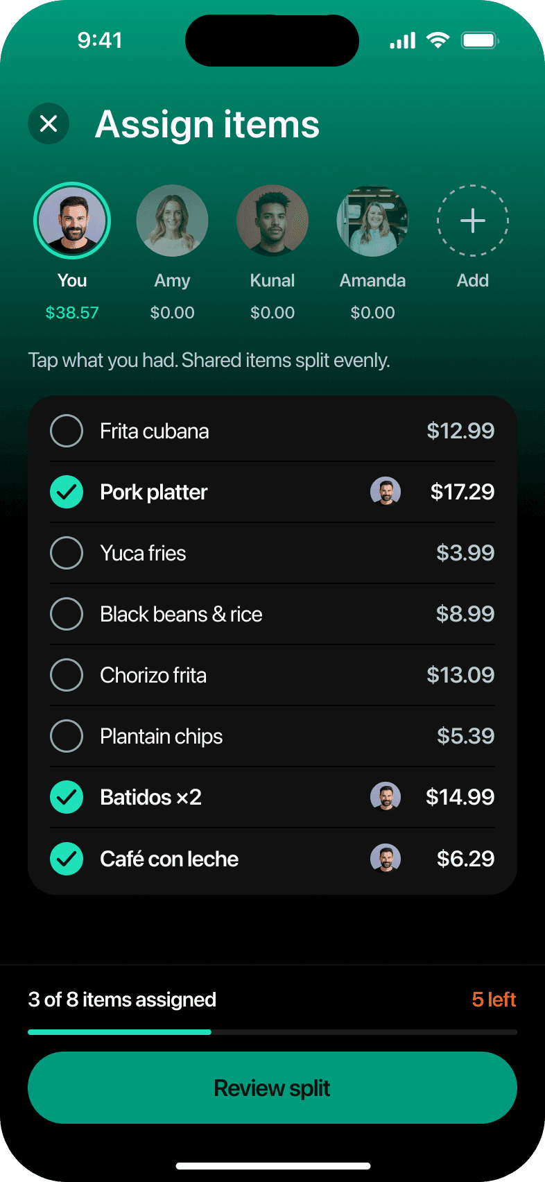
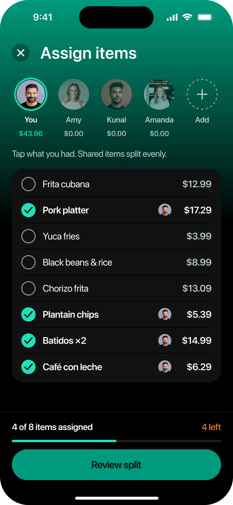
The design system behind it
Every screen in that flow is built from one set of tokens and 32 components. Here is how the system is put together.Typography
SF Pro Display for headings, Text for body.
Ag
SF Pro DisplayHeadings, 20pt and above
ABCDEFGHIJKLMNOPQRSTUVWXYZ
abcdefghijklmnopqrstuvwxyz
0123456789 $ + - = %
abcdefghijklmnopqrstuvwxyz
0123456789 $ + - = %
Ag
SF Pro TextBody, below 20pt
ABCDEFGHIJKLMNOPQRSTUVWXYZ
abcdefghijklmnopqrstuvwxyz
0123456789 $ + - = %
abcdefghijklmnopqrstuvwxyz
0123456789 $ + - = %
Color
A smaller palette, one job per color.
Teal
300
#1EE1B9
500
#009B7C
600
#00735C
750
#00664F
Orange
400
#E8662C
500
#D84912
600
#B83A0B
Dark surfaces
1000
#000000
900
#111111
850
#1E1E1E
800
#162937
Light surfaces
0
#FFFFFF
50
#F3F6F5
75
#EDF2F0
150
#D5E2DE
Text on dark
25
#FBFDFF
100
#DCE5EA
200
#BBC9D3
300
#95A6B2
Text on light
950
#0B1B17
600
#3E4E58
500
#56666F
Text on card
Aa Primary18.5:1 AAA
Aa Secondary11.2:1 AAA
Aa Tertiary7.5:1 AAA
Aa Accent11.3:1 AAA
Tokens
Values, primitives, then semantic tokens.
Value
The raw hex code.
Primitive tokens
Each value named on a scale.
Semantic tokens
Named for the job the color does.
#1EE1B9
teal/300
text/accent
#009B7C
teal/500
action/primary-bg
#111111
neutral/900
surface/card
#FBFDFF
neutral/25
text/primary
Components
One button, four styles, three sizes.
Large 52pt
Medium 44pt
Small 34pt
Disabled
Primary
Secondary
Tertiary
On-gradient
Before52pt44pt44pt40pt34pt32ptThe old screens used six button heights. Now there are three.
Component library
Built once in Figma, reused everywhere.
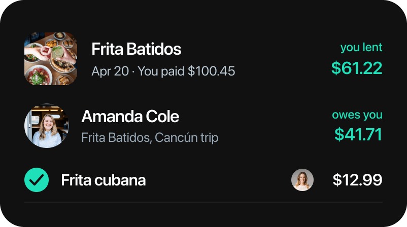
List rowsExpense, friend, item and five more
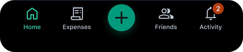
Tab barActive tab, badge and the center Add button
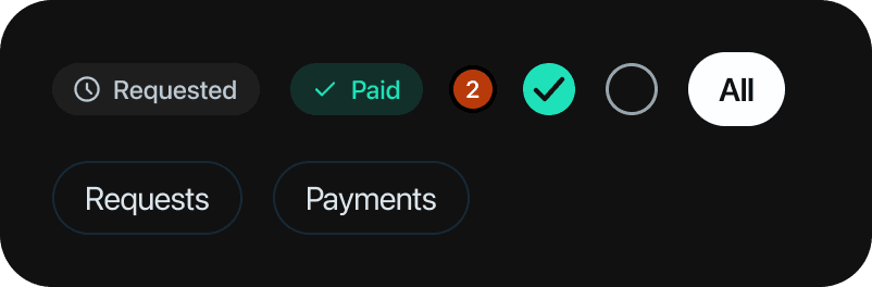
Status and controlsStatus pill, badge, checkbox, chip
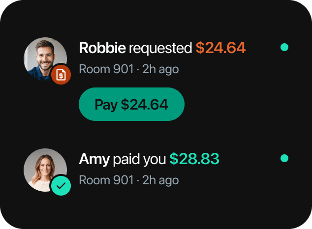
Activity rowRequest, payment, reminder
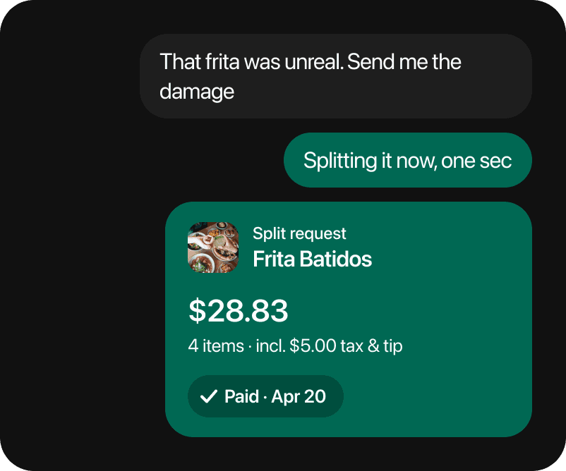
ChatBubbles and the split request card
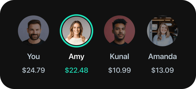
Assign personSelected ring, running total
118tokens
32components
75variants
288uses across the screens
Anatomy
One screen, seven components.
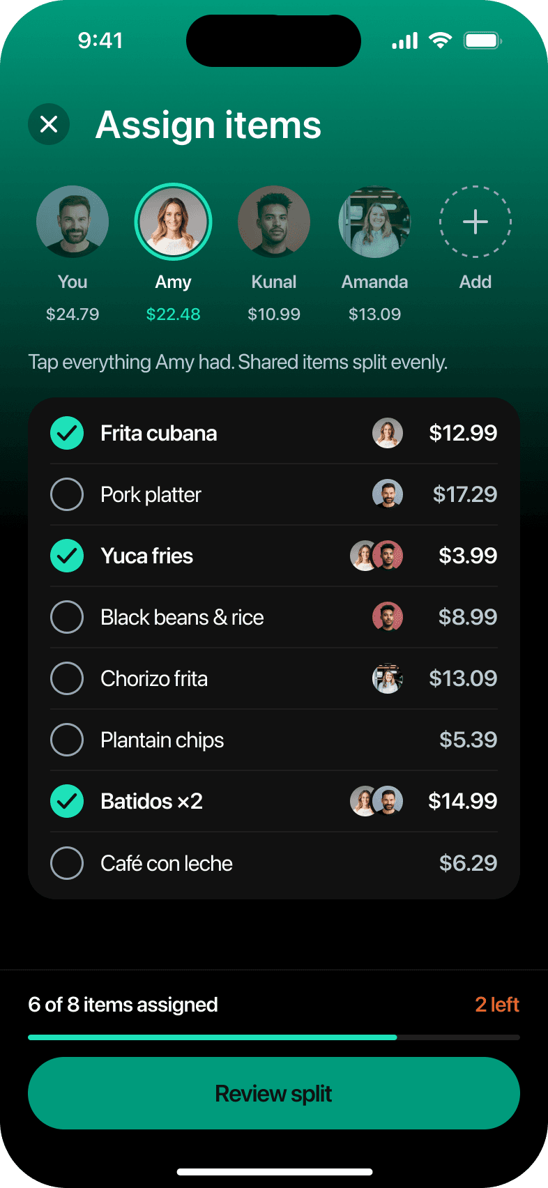
- 01Nav barClose + Title 1
- 02Assign personState=Selected
- 03Item rowAssigned=True
- 04CheckboxState=On
- 05Avatar stackCount=2
- 06Progress bar6 of 8
- 07ButtonPrimary, Large
Accessibility
Built to meet WCAG AA.
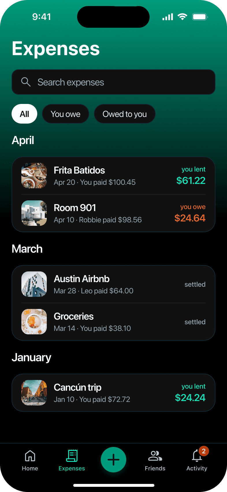
you owe$24.64
Two shades of orange for money owed
Large amounts use #D84912 (4.4:1). Text below 17pt uses the lighter #E8662C (5.7:1) to stay above AA.
44 × 44
44pt tap targets
Close and back look like 30pt circles, but each responds to a 44pt area.
RequestedPaid
Status never relies on color
Each status pairs color with a word or an icon: you owe or you lent, Requested or Paid.
Documentation
A Figma page for every component.
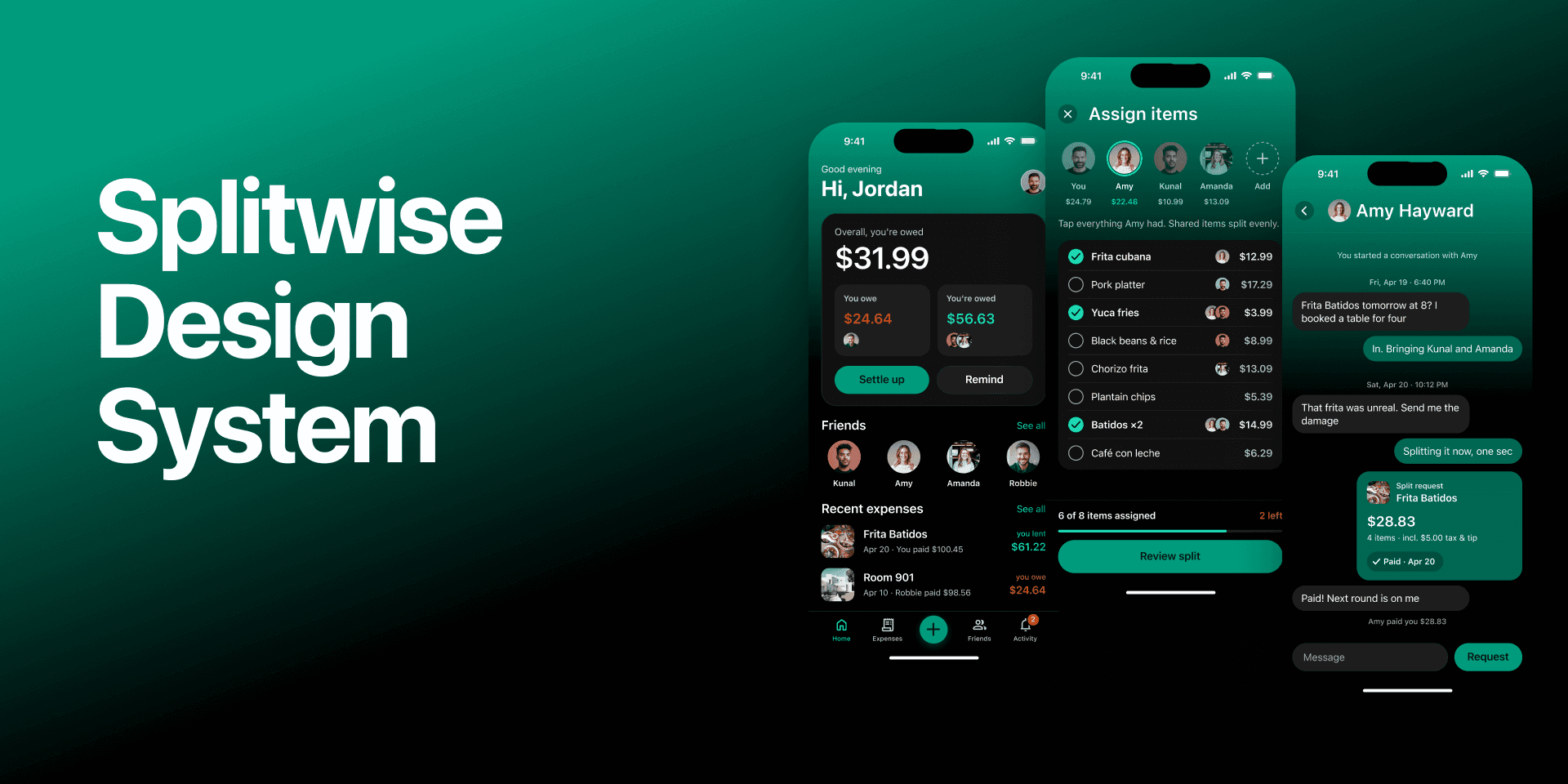
Read me
Principles, key decisions, and what to do and avoid
Foundations
Four pages: color in both modes, type, spacing and icons
Components
Thirteen pages of variants, properties, tokens and usage
Screens
All 17 screens, each one also in light mode
Light and dark
Light mode, no redrawing.
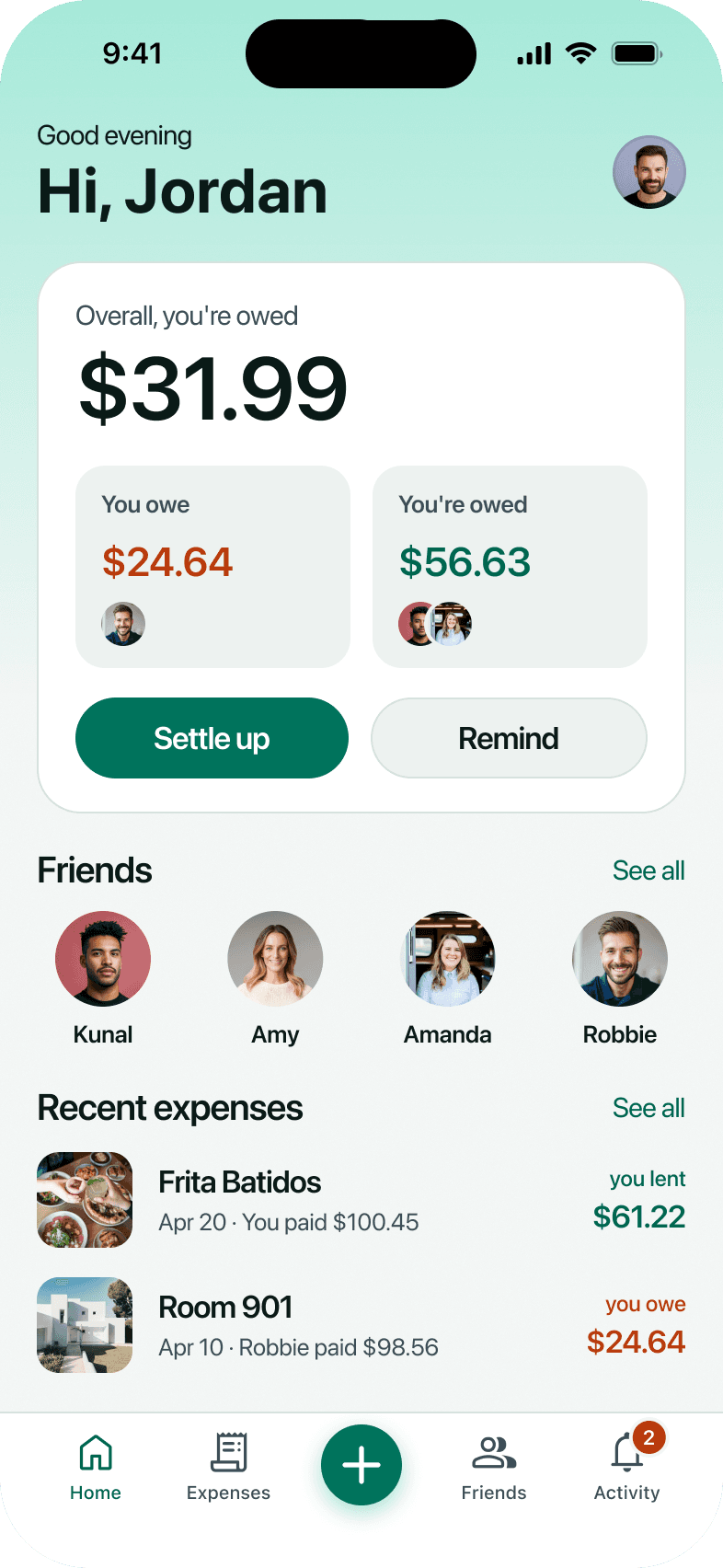
HomeDark
Assign itemsDark
Review splitDark
ChatDark
All screens
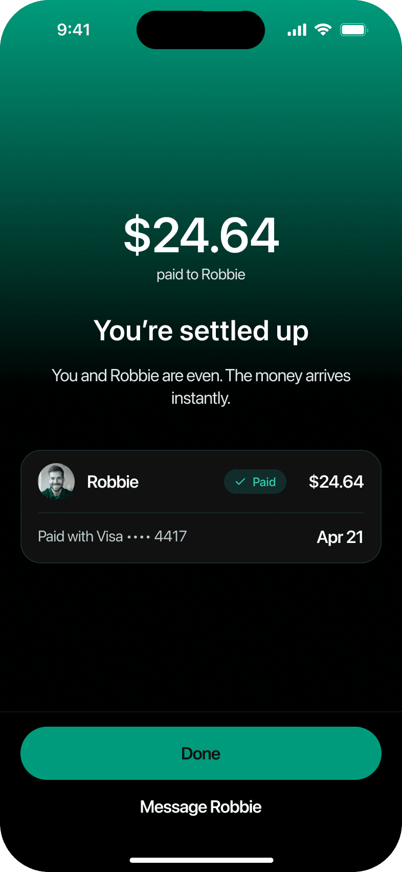
Every screen I designed






Other projects


Let’s work together
Available for opportunities
© 2026 Deeksha Kini. All rights reserved