
HealthRise’s Denials Navigator
HealthRise’s flagship product, Denials Navigator, flags spikes in insurance claim denials so billing teams can trace the root cause before more revenue is lost.
60%
faster resolution
35%
fewer steps

My role
Product Designer
Team
1 PM, 2 researchers, 1 designer
Timeline
4 months
Status
Shipped
Context
HealthRise’s Denials Navigator helps identify the root causes behind major spikes in claim denials
Denials are expected, with at least 1 in 10 claims coming back denied (Experian Health, 2025). But a sudden spike often signals a deeper problem, such as a payer policy change or a coding update. It flags these spikes early so hospital billing teams can investigate the root cause and fix it before revenue is lost.

Patient receives care

Hospital bills insurer

Insurer denies claim

Hospital finds root cause
“Denials are not the problem; they’re the symptom.”
CEO, HealthRise
Problem
Navigator looked better than other tools, but felt clunky, unintuitive and inefficient to use
One investigation, three tools
1
Review tasks
Navigator
2
Prioritize cases
Navigator
3
Scan trends
Navigator
4
Pivot for patterns
Excel
5
Verify accounts
Epic
6
Document and act
Navigator
What analysts told us

Clunky
“A lot of clicking” and “cumbersome”

Tedious
“You have to type your filters manually. It’s tedious.”

Inefficient
“It almost felt like I was documenting it twice.”
How might we
Enable hospital billing teams to identify the root causes of denial spikes in fewer steps and with greater confidence
Immersion
Information was hard to surface, so Navigator was used to spot spikes but Excel to investigate them

Key takeaways
01
Heuristic audit
Eleven metrics, none pointing to the root cause
02
COGNITIVE WALKTHROUGH
Spikes found in Navigator, investigated in Excel
03
USER Interviews
Manual and repetitive steps slowed every case
Reframe
To keep the investigation inside Navigator, we reprioritized the metrics and added top drivers
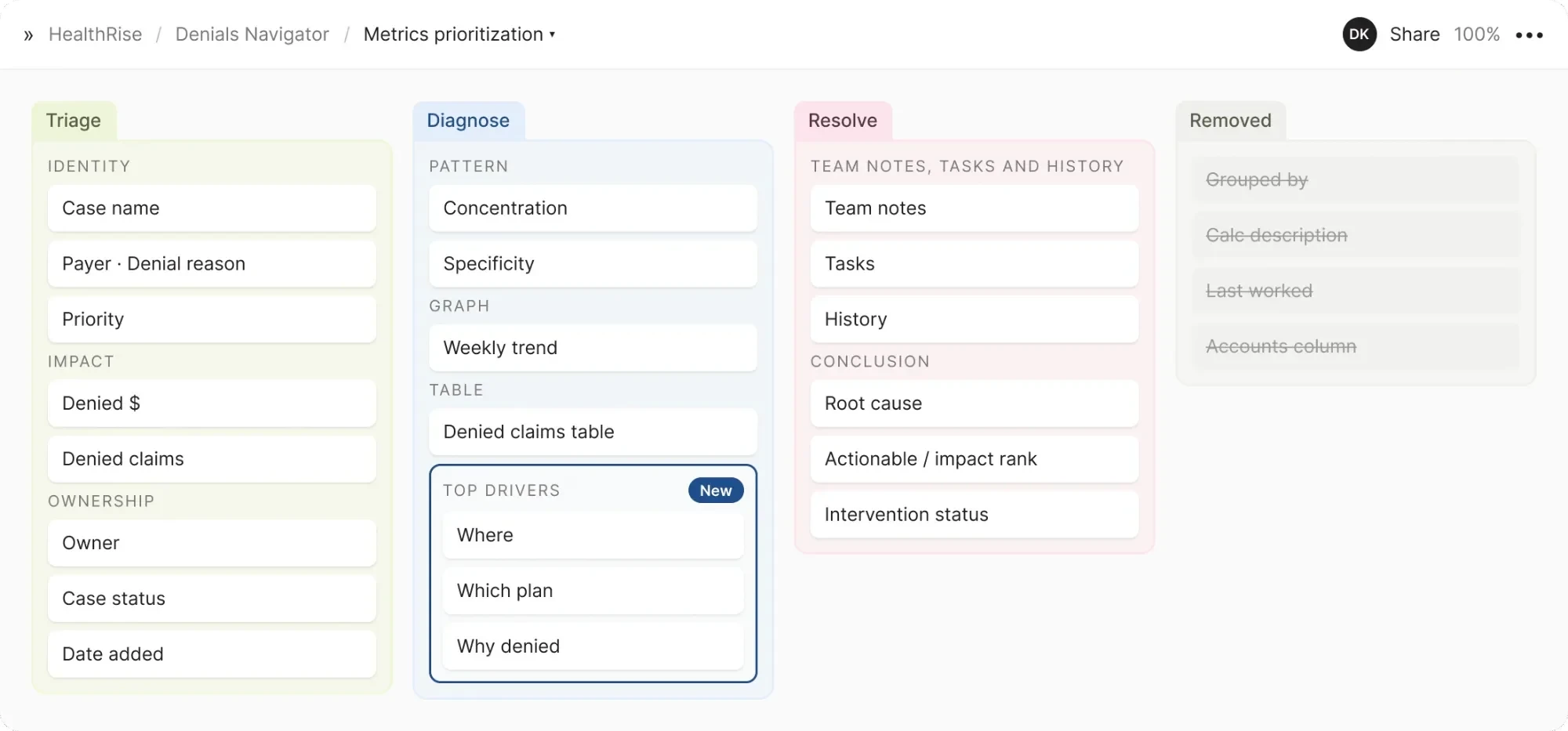
Design principles
01
Lead with what’s at stake: denied dollars and claims come first.
02
Answer the pivot in place: rank where, which plan and why on the page, not in Excel.
03
Evidence before conclusions: root cause only after the evidence is reviewed.
Design exploration
How do we surface the most important information?
Analysts looked at denied dollars first. The audit found eleven header metrics at equal visual weight.
Prune to the essentials
Cuts eleven metrics to six cards, but it stays a flat list with nothing to guide the eye.
Cluster by meaning
Groups every metric under impact, pattern or source, so the stakes are found first.
How do we visualize the root cause?
Pattern-finding lived in Excel pivots. Analysts needed where, which plan and why, together and ranked.
Donut rings
Angles are hard to compare (Cleveland & McGill), and the ranking is lost.
One list, three tabs
Each tab hides the other two answers, so analysts compare from memory.
Ranked bars
Length on a shared scale reads fastest, in rank order, all at once.
How much should analysts see at once?
Analysts work on big monitors and said it felt like “documenting it twice” across pages.
Three guided steps
Evidence has to be remembered between screens, which adds recall load.
Panels behind buttons
Every hidden panel is one more click between the analyst and the answer.
Everything on one screen
Matches the dense, wide workspaces analysts already use.
Solution
Final design
Decision
Designed around analysts’ workflows and mental models
consolidating complex data into one view optimized for large screens.
Outcome
Analysts now find the root cause
without leaving Navigator
Other projects


Let’s work together
Available for opportunities
© 2026 Deeksha Kini. All rights reserved